Tonight was an SVU “Special Double Episode Encore,” which turns out to be … two reruns. Click these links for my take on “Personal Fouls” and “Spiraling Down.” One interesting thing to note is that “Personal Fouls” — an episode about a basketball coach who sexually abuses the underprivileged boys who sign up for his charity — aired before the Joe Paterno/Jerry Sandusky scandal broke. Don’t know how the SVU writers managed that one.
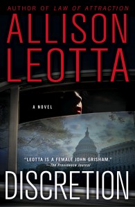
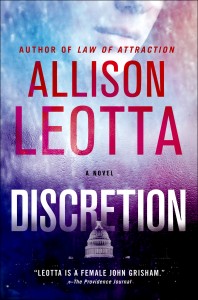
In personal news, my publisher has proposed two possible covers for my next book, “Discretion.” The plot revolves around a political sex scandal that ensues after a high-priced escort is thrown from a balcony of the U.S. Capitol. The book is coming out in July, but meanwhile, there’s been lots of debate about which cover to use. What do you think? If you have a moment, I’d love to hear your thoughts!


 Bill says
26 January, 2012 at 2:34 amChoice #1 seems to do a better job of conveying the idea of a political sex scandal kinda thing.
Choice #2 looks more like it’s going to be about a woman in politics. Or a woman taking on congress. Or something. Which your book may also be. The woman in #1 definitely looks like an escort, in #2 she looks like your main character.
But since your description of your book was “a political sex scandal,” I’d go with #1.
 V.E. says
27 January, 2012 at 7:55 amagreed on all points.
 Katie says
26 January, 2012 at 1:25 pmI like the second, the first is too dark.
 TokoBali says
26 January, 2012 at 2:19 pmThe first one, because it’s so dark. The colors for the second one looks more like some spiritual thing. And “the female John Grisham”? No that’s a quote for the front cover, for sure.
 Alenna says
27 January, 2012 at 12:08 amChoice #1. Conveys a more stark, harsh, political and mystery-novel feeling than the other (like maybe an Agatha Christie in Washington). I think of Sue Grafton and John Grisham novels.
Choice #2. Politics, but with a more romance-novel appeal. Like perhaps the story involves the DC Madame or politicians and prostitution, and a bit more female POV. I think of Sidney Sheldon and Danielle Steel novels.
I like both covers! I guess which one is best really depends on what the story is about and who you want to appeal to as readers.
 kimsch says
27 January, 2012 at 12:39 amI like choice one.
 Allison Leotta says
27 January, 2012 at 2:57 pmThanks so much for all the comments! I really appreciate having a community of crime-drama buffs to bounce this stuff off! It’s great to hear your reactions to the images. Choosing a cover is one of the funnest parts of the publishing process, and it’s even more fun to share it. I’m going to pass your comments along to my publisher. Thanks for the insights!
 Rob says
29 January, 2012 at 9:44 amChoice #1 definitely. Conveys intrigue and mystery pretty clearly, makes you wonder who the woman is, what the story behind the image is, and is far more interesting to look at from a design/composition perspective. I also know that if I were browsing a bookstore I’d probably be less likely to pick up the one bathed in hot pink and purple. Black, red and white contrast well and ‘pop’ more than the alternate colour scheme, and I think would probably stand out on the shelf. The second design is rather generic and looks like about ten different paperback thrillers I have on my bookshelf.
 Allison Leotta says
30 January, 2012 at 2:19 pmBut are those ten paperback thrillers any good? 🙂 Thanks for the input!
 Tracy March says
29 January, 2012 at 3:38 pmHi Allison,
Sorry I’m late to the cover party! How fortunate of you to have two wonderful covers that might end up being yours. I’m partial to the first one. Your name and the title stand out nicely, and I love the clever idea of the reflection in the window.
I can’t wait to read DISCRETION!
 Allison Leotta says
30 January, 2012 at 2:17 pmThanks, Tracy! How’s “Girl Three” coming? I can’t wait to read it!
 Bob says
30 January, 2012 at 6:22 pmThey’re both cool. I’ll read it whatever cover you choose.
 Allison Leotta says
31 January, 2012 at 5:19 pmThanks so much, Bob!
 Bani Productions says
8 February, 2012 at 11:37 amChoice One. Never too late to put in a vote. Came upon you through a link shared by George Pelecanos. I am an aspiring writer myself but not crime. I am going to get your first book.
 ALeotta says
8 February, 2012 at 4:51 pmThanks for stopping by! I hope you like my book. Best of luck with your own writing!
 Robin Billings says
13 February, 2012 at 9:55 amI’m late to the party, but just found your blog – got here through your article reprinted on Mulholland’s.
Good article!
If I ‘m not too late, I much prefer cover #1. It’s t h ekind of cover that would make me stop and check out the book. Hope this helps!
 Allison Leotta says
14 February, 2012 at 10:17 amHi Robin, Thanks for checking out my site, and for the input! I really appreciate it.
 Aileen Marshall says
14 February, 2012 at 9:45 am#2 will stand out more in the stores I think. It will also attract people (like me) who like pretty book covers 😀
I like #1 as well, but there area already too many books with the “Dark Capitol” theme. So people might be like “Oh, another DC story …”
So I’d go with #2.
 Allison Leotta says
14 February, 2012 at 10:18 amThanks, Aileen! As a librarian, your opinion means a lot to me! How are things in the library world?
 quatisha brown says
17 January, 2025 at 2:49 amI just want the whole world to know about this spell caster I met two weeks ago,I cannot say everything he has done for me and my family I was going through online when I meant this wonderful man’s testimony online how he won a lottery through the help of dr Ose I decided to just give it a try and my life is back to me now after i lost my job due to covid he gave me a winning numbers to play lottery and i won 5000usd for my first play since then i have been working with him and he has been giving me numbers to play my lottery i can not write everything he has done for me if you need a lottery spell today contact him on oseremenspelltemple@gmail.com www.facebook.com/Dr-odion-spell-temple-110513923938220
whatsapp +2348136482342
 Palermo Diaz says
11 February, 2026 at 10:14 pmWow what a good God I am so excited to tell you all how I become a millionaire I’m a woman of faith I was reading a comment on google where I meet a man sharing how Dr UYI cast a spell for him and he get his wife back after the spell I was interested I have to do research when I was doing the research I got so many testimony about this same man call Dr UYI how he help people to win lottery how he help people to get there ex back how he help people to do so many things I was happy and I contact him to help me win the lottery when I contact him and he told me what to do and after I did what he ask me to do he den gave me a lottery number to play and told me to go and buy ticket after playing the game I was so surprise the game come out good and I won the sum of 90, 000,000 dollars i was amazed and promise to share it to the people around me if anyone is willing to play the mage lottery it should contact Dr UYI so he can give you the right number to play thanks to you Dr UYI I’m so so grateful contact Dr UYI via drzukalottospelltemple@gmail.com OR WhatsApp on +17174154115